


Let’s say you just started a company, have a product/ service to sell so you need a website. You think everything is equally important so you make everything pop. You’re afraid people miss the opportunity to buy your product so you make every CTA (call to action) button as big as possible. And here’s everything going downhill. You’re making everyone confused because you don’t have hierarchy. Making a website is like arranging stuff in your house - what you want to display and where you put stuff away in a logic sense so you can find them.
LET IT FLOW
There are lots of ways telling a story so does the structure of your website. That’s how I usually structure the commercial website.

I use color blocks to differentiate each fold but it can be photos, collage, pattern, or the same color. I’ve designed a website that only has one fold at its homepage, but you can swipe left/right for more content. It’s the same concept but operating flow is different. The homepage should be concise and engaging. Put all the details in other pages or allow people to expand some parts.
Keep your navigation/menu simple
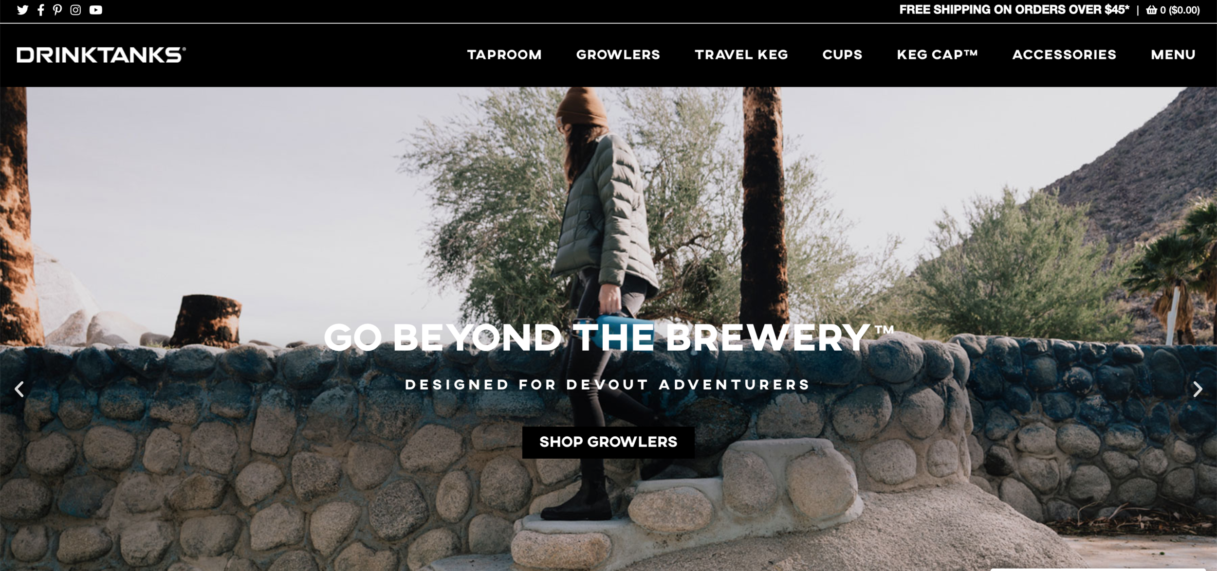
Drinktank website is not bad. It’s clean with high-quality photos and consistent style. But it has 7 items in the navigation bar, including a “menu”??
The most common thinking is putting everything up there so everyone can see it right away and then convert to the sales. And there are 13 tabs at the navigation. No, you’re overwhelming us only. A bad navigation is like frustrating costumers in the grocery store - you can never find the stuff you need.
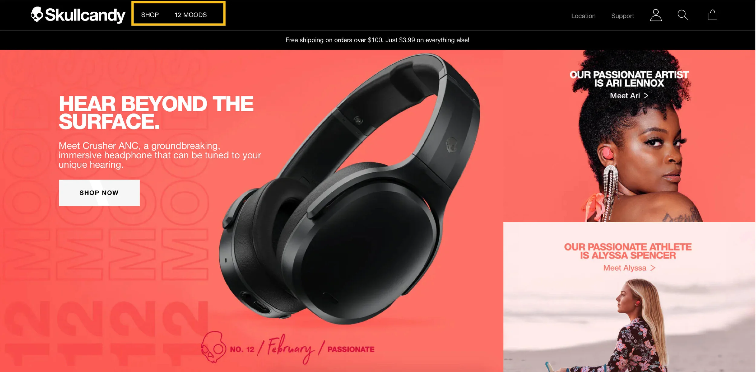
Look at how Skullcandy keep their menu in only two. Here’s how you can find all the products when you click “shop”.
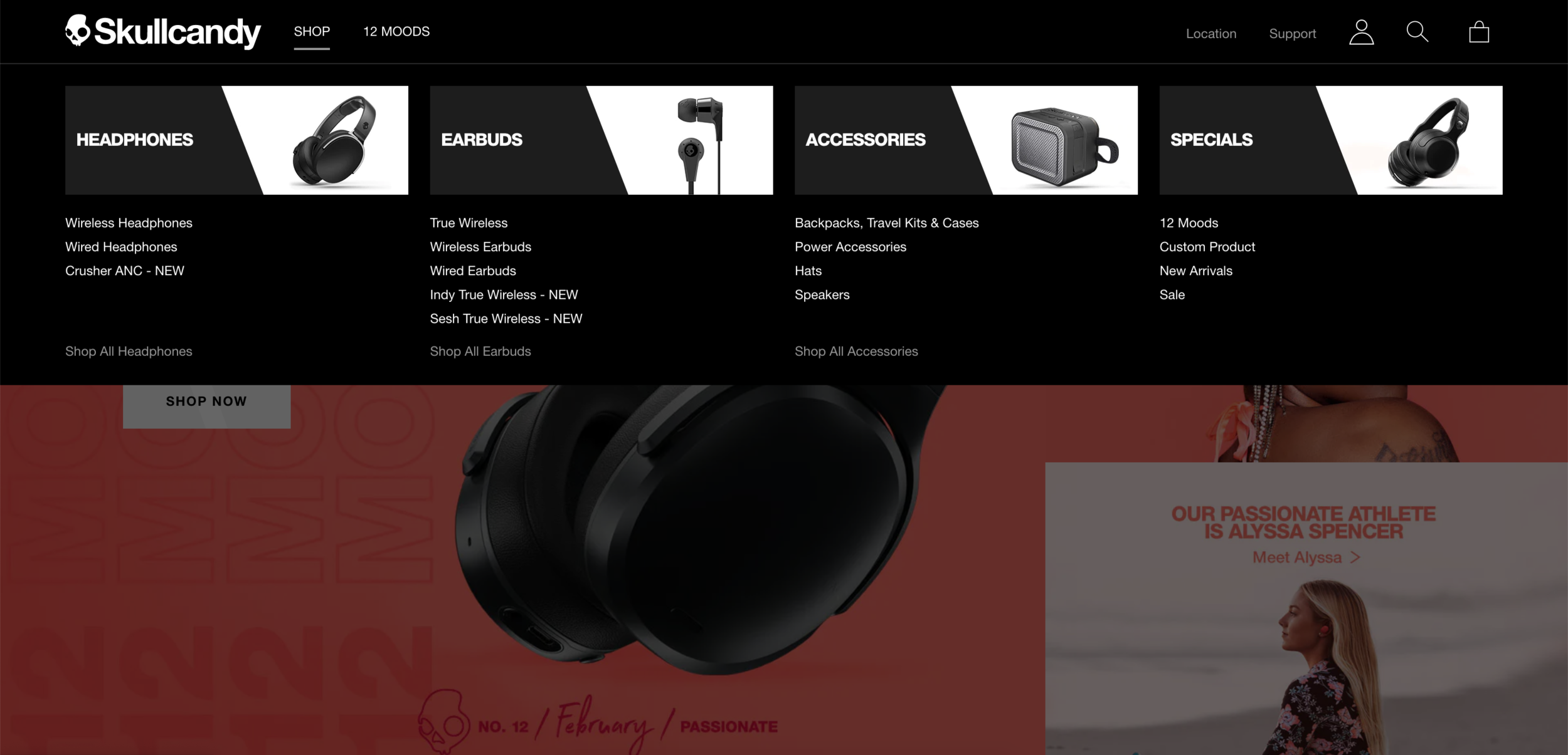
Isn’t that nice? The big header with simple image and consistent style, people can easily understand what types of products they offer.
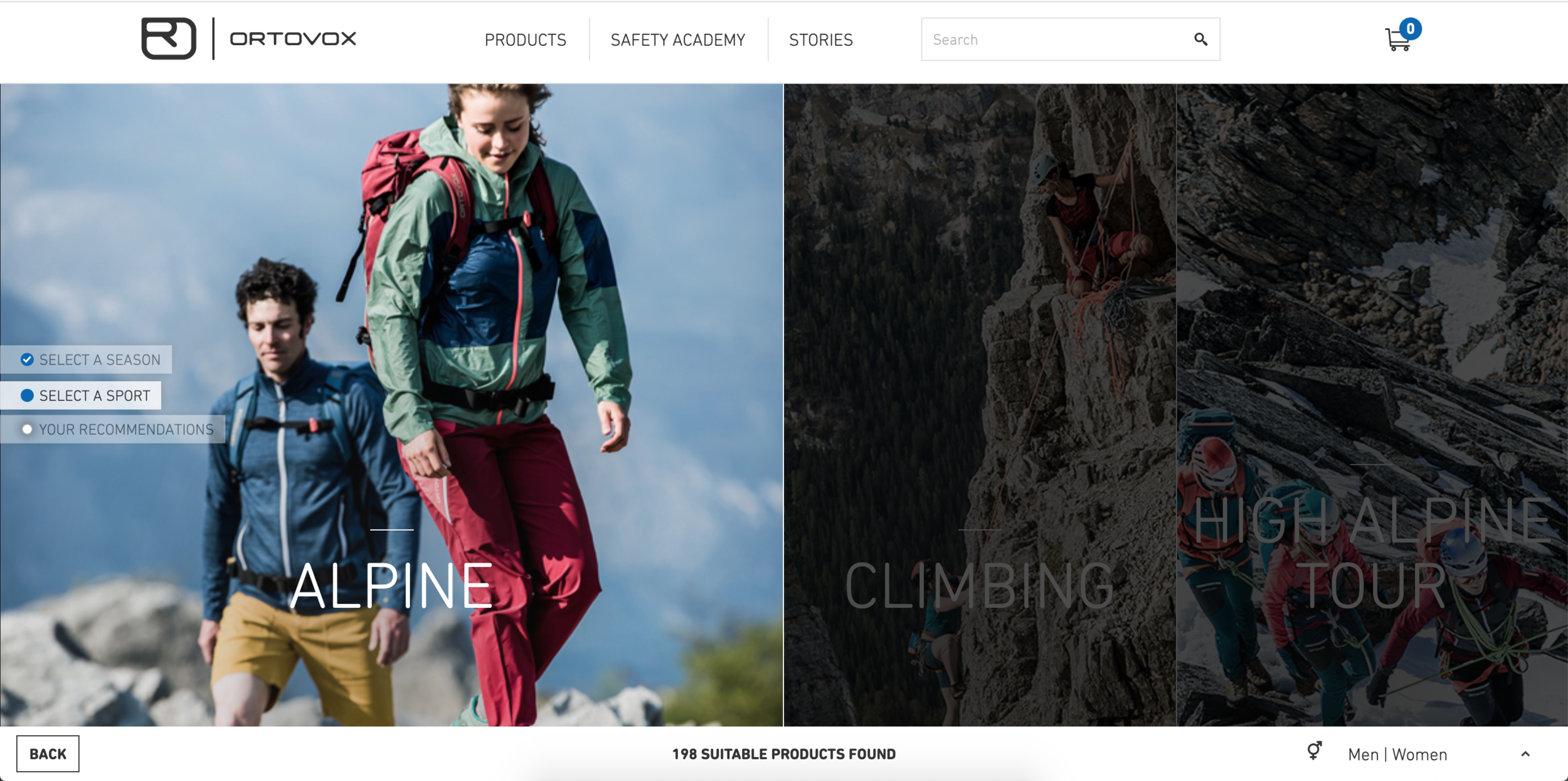
What if you have lots of different product lines? How do you help your customers to know what to buy? A product comparison page or an interactive product advisor page (like this Ortovox page below) will be really nice.
Have some self-control on colors
When people think about making website more “fun” or appealing, they can’t help but asking more colors to it. How you present on website is like how you dress. If you want to look professional, keep it simple and clean. You can choose a strong accent color or interesting pattern to make it pop. Keep in mind that you usually would have photos in your website and that usually includes lots of colors. So keep your text and background super simple and minimal color is really important. Or you might make your website looks like a clown.
So how do you make the web experience more “fun”? Below is a really good example how to present your products playing with brand colors and interactive elements making a “fun” experience.
You need space to breathe
You’re telling a story. You want your audience to be engaged the whole time, and the break between the lines is indispensable for being a good story-teller. So does your website. Here’s an example from Black Diamond website.

Now see The North Face, they do a better job in giving negative space. Even it might be just a bit different but it looks less busy and easier to digest.

Please follow the style guide
You should have a style guide specify the logo usage, typography, colors and such. If you don’t have one, please refrain using 1-2 fonts at most. (If you’re using 2 or more fonts in your brand, please make sure they work well together.) Here’s an example of big NONO -

I’m guessing they outsourced the website redesign and somehow didn’t pass the brand style guide along. The fonts they use on the graphic are different than the website. It ended up showing at least 4 different fonts on this website.
—-
These brands update their website quite often so you might not see exact the same thing when you visit the site. Also these are like general rules and you have to apply it based on the situations. And there’s always exception. But you better know what you’re doing if you’re breaking the rules.